Helvetica, Universal, Arial, Comic Sans - It Takes All Types
Jun 29th, 2007 by Jim Kennedy
With no presold tickets, the queue did indeed stretch down Leeson Street from an hour before showtime. I was dreading someone I knew happening by and demanding to know what I was lining up to see. If I was spotted, my plan was to pretend I was not queuing but smoking outside Hourican’s pub and not associated with the trendies going to see a film about a font. No sir, I was prepared to take up smoking.

I don’t think I’ve ever seen so many Apple Macs on screen since Sex and the City, I don’t think I’ve ever seen so many audience members toting messenger laptop bags since I was last in San Francisco, and I definitely haven’t seen so many of those trendy black-rimmed glasses since I was last in Specsavers. The queue must have looked like the queues outside Apple stores today in the US, with the iPhone going on sale.
I’m not involved in the design world. I have a Dell laptop, albeit with a nice bag, but I have boring glasses, and you should see my clunky phone. I’m a design catastrophe.
Also, I’ve never been so out of the loop at a question and answers session - what the hell is this ‘foil blocking’ and why is it so derided? Design types (bad pun intended) seem an odd lot, curiously likeable once you let them get in their cheap shots about Microsoft, Arial, and so on. Some of them have serious issues with the ubiquity of Helvetica, some love it for it’s bland, blank-canvas quality, some resent it for the same reason.
All were animated on the subject.
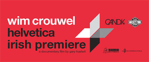
The movie itself was an interesting run-through of the world of design since the 50s, pegged around the story of Helvetica, now at 50 years and going strong. Apparently, the arrival of Helvetica was a ground zero event in the heady world of fonts and graphic design and so on, something hard to comprehend this far down the line.
The evening kicked off with Wim Crouwel, Dutch graphic design meister of some note and one of the talking heads of the film, presenting a slideshow on his career designing posters, exhibitions, displays, and experimenting with fonts. Crouwel was one of the early adopters of Helvetica, but admits to using it largely as his secondary font. Very contentious stuff.

The film itself was a bit out of left-field for me - I expected a hagiographic treatment of the subject, but it was fairly even-handed. There are as many lovers of Helvetica as there are those who find it repugnant. The movie interviews various legends of the field (at least everyone else in the room had heard of them before, except for lonesome me nursing my complimentary drink), and these unexpectedly funny people, clearly love what they do and have dangerously personal relationships with fonts.
Director Gary Hustwit, whose previous work includes documentaries on Wilco and Death Cab For Cutie, seems to have wandered the world interviewing leading figures in the industry and spent an inordinate amount of time on the streets of New York, London, Amsterdam, and other cites finding interesting examples of the use of Helvetica. It’s everywhere. Like, everywhere.
The Q&A session afterwards featured Crouwel, Hustwit, and a number of Irish graphic designers, as well as English designer Michael C. Place, who also featured in the film. Don’t ask me what they were on about, but whatever it was, Macintosh is the answer.
If Helvetica were a phone, it would be a Nokia. If Helvetica were icecream, it would be a bowl of vanilla. If Helvetica were music, it would be vocal-free Sigur Ros. If Helvetica were a drink, it would be tonic water. Helvetica is all about what you do with it. This much I have learned.
If you want to learn more, the DVD will be out in October. Now, can we stop talking about a bloody font and get back to the normal stuff?


Nice one Jim. If I’d made it I would no doubt have been standing in a crowd of goatee sporting designers scratching my scruffy beard in bemusement.
…but whatever it was, Macintosh is the answer.
I couldn’t agree more….he says, bashing away on his Dell PC.
I was thinking of going. But… I don’t know. The design and visual culture world is a bit self-regarding at the best of times, and the Irish design world doubly so… as I tap away at my Apple keyboard….
Remember though PC users… Arial is just a knock off of Helvetica…. http://www.ms-studio.com/articles.html
Pesky not reading the previous article where you already have the link…bah, humbug…